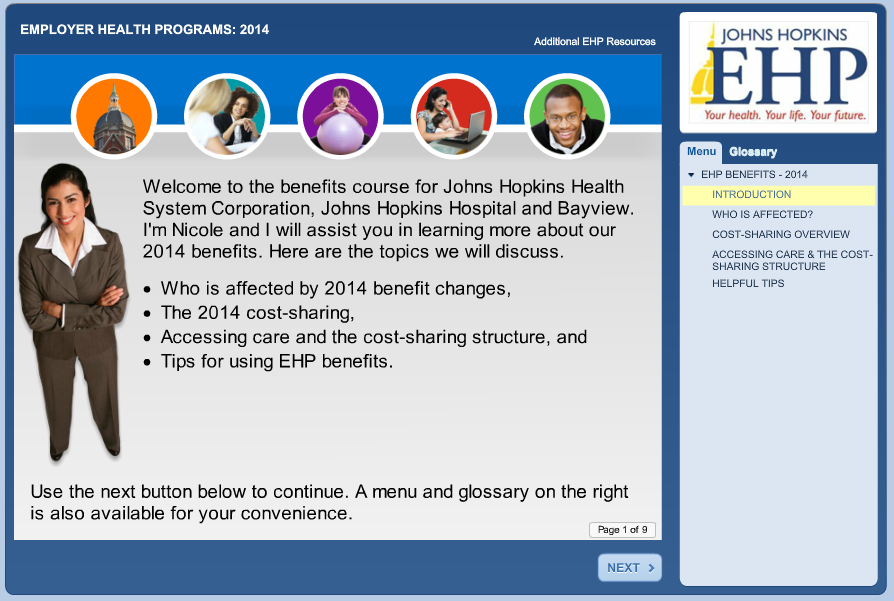
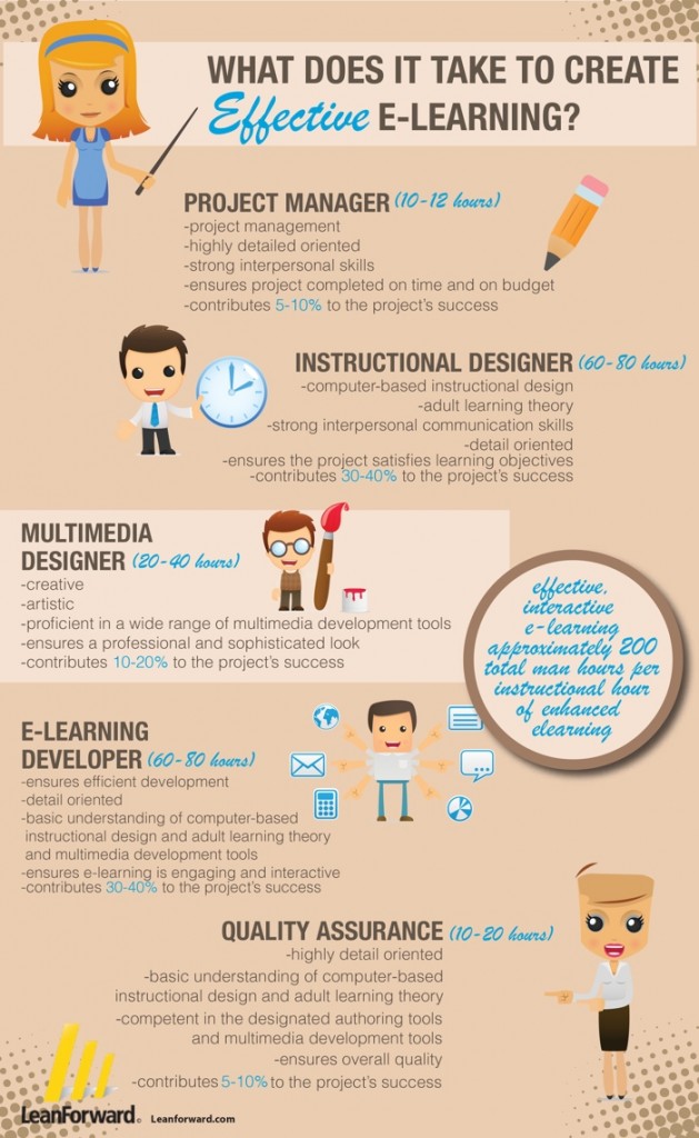
Here is where prioritizing the must, good and nice to knows pays off.
- That "must" content is front and center - your emphasis.
- The “good” is still accessible but may not be up front - a bit deeper into sections, appear in interactive assets, pop-ups, etc.
- The "Nice to knows" - We are not using up real estate on these. These are:
- Things that people who really want to learn more - curiosity or using the info at a higher level than the target audience.
- Things we told the SME we would fit it in when we were compromising.
- Great for pop-ups, an additional resources page, links to other sites, supporting materials, social media, informal learning resources or in additional interactive elements,etc.
- Navigation - The course does not need to be linear - especially if audience has diverse learning needs, for example they may not need all the content. This will allow them to pick and chose what may be relevant to their learning needs and not make the course unnecessarily long for them.
- Games - Lot of content, but not thrown at you all at once and a game can simultaneously put it in context - can be more "show" not "tell."
- Cartoons - Simple scenario showing concept that brings it home instead of in-depth explanation of the concept.
- Use analogies - Quicker and easier to understand if has similarities to the familiar - Remember, the audience brings knowledge to the table, tap into it.
- Job Aids – Sometimes a job aid can be a better route, especially if it is something learners have to remember specific steps and apply on a less than regular basis (e.g., a task in software application). These are also good for a "Nice to Know" task that may not apply to all – Open it if you need it. Infographics may also suffice if the content is more informative than step-by-step.
- Grammar & Style – Don’t make them read “War & Peace!” Trim the prose down as much as possible (i.e., eliminate passive sentences, successive propositional phrases, wordiness, etc.).


